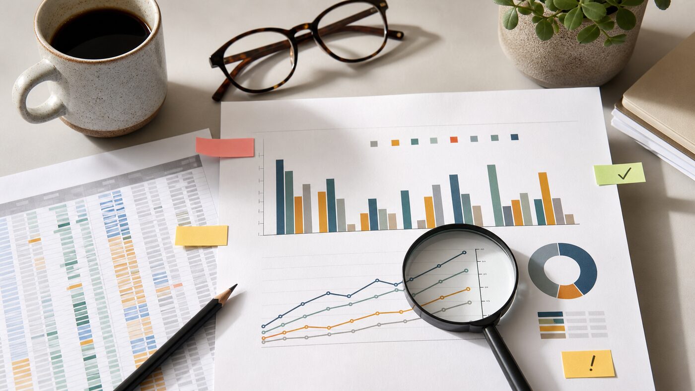
As of June 11, 2026, the practical question is no longer whether ChatGPT can turn a spreadsheet into a chart. It can. The more useful question for a small team is whether the chart is ready to be shared in a report, client update, board note or sales review.
OpenAI's June 8 ChatGPT release notes mention app experience improvements to charts, table of contents and full-screen writing. OpenAI's data analysis help page says ChatGPT can analyze uploaded files and create tables or charts when a structured view helps. A separate data analysis guide describes interactive table and chart work with uploaded data.
That is useful. It also changes the review habit. A chart that looks polished can move faster than the team that understands the data behind it.
Before sharing an AI-made chart, run a short review that checks the source, the calculation, the visual choice and the export context.
Start with the source file, not the chart
The first review question is not "does the chart look good?" It is "which file did this come from?"
OpenAI's data analysis guidance recommends structured data with clear column names and one record per row. That matters because ChatGPT can only reason from the file and instructions it receives. If the uploaded spreadsheet has merged headers, hidden notes, old tabs, mixed date formats or duplicated exports, the chart may summarize a messy source cleanly.
For every chart, write down:
- the file name and date;
- the tab or table used;
- the row range or filter;
- the columns included;
- any rows excluded;
- whether the data is final, draft or sampled.
This is especially important when files come from connected storage or repeated exports. "Latest pipeline report" is not a source. "CRM pipeline export, June 10, filtered to open deals in EMEA" is a source someone can check.
Ask for the calculation in plain English
Do not accept a chart until ChatGPT explains the calculation behind it. The explanation should be boring:
- "Revenue is summed by invoice month."
- "Conversion rate is won deals divided by qualified opportunities."
- "Average response time excludes blank values."
- "Churn count uses customers with cancellation date in the selected month."
If the explanation uses vague language such as "overall performance" or "engagement trend", ask again. A chart for business use needs a measurable definition, not a label that sounds right.
Then test one point manually. Pick a month, category or bar and calculate it yourself from the source rows. If one visible point is wrong, the whole chart is not ready.
Check whether the chart type matches the decision
Presentation-ready does not mean decision-ready. A polished chart can still be the wrong chart.
Use a line chart when the decision depends on change over time. Use bars when the decision depends on comparison between categories. Use a table when exact values matter more than shape. Use a scatter plot only when the relationship between two variables is the point.
Be cautious with:
- pie charts with too many slices;
- stacked bars when people need exact comparison;
- dual-axis charts that make weak relationships look strong;
- averages where the range or outliers matter;
- percentages without the underlying count.
The right prompt is not "make this look better." The right prompt is "which chart type supports this decision, and what would it hide?"
Keep the prompt with the output
When a chart becomes part of a report, save the prompt or instruction that created it. This does not need to be formal. It can be a short note:
Chart created from June 10 support export. Prompt asked ChatGPT to group tickets by first response time bucket, exclude test tickets, and show percentage of total.
That note prevents two common problems. First, someone can reproduce or challenge the chart later. Second, the team can see whether the prompt introduced a choice that should have been discussed, such as excluding blank rows or grouping small categories into "other."
If the chart is used in a recurring report, turn the prompt into a small template. Include the expected file, filter, chart type, and manual spot check. A reusable prompt is safer than a new improvised instruction every Friday afternoon.
Watch the export boundary
OpenAI's file upload FAQ says users can upload spreadsheets and ask ChatGPT to understand and visualize the data. That workflow is useful inside a chat, but sharing the result outside the chat changes the risk. A downloaded chart, copied image or pasted report paragraph may lose the context that made it understandable.
Before exporting, add the missing context:
- reporting period;
- source system;
- last refresh date;
- filter choices;
- whether numbers are rounded;
- whether the chart is exploratory or final.
If the chart is going to a client, investor, manager or public page, add a stronger review. The chart should be checked by someone who understands the source data and the business definition. ChatGPT can help draft and visualize; it should not be the only reviewer of numbers people will act on.
Separate analysis from design polish
Ask for analysis first and design second. If you begin with "make a polished chart for a presentation", the conversation may optimize for appearance before it settles the definition.
A better sequence is:
- "Inspect this file and tell me what each column appears to mean."
- "Suggest three useful questions this data can answer and three it cannot answer."
- "Create a chart for question one and explain the calculation."
- "Show the rows behind the highest and lowest points."
- "Now make the chart easier to read for a report."
This keeps the review in the right order. First understand the data. Then choose the question. Then produce the chart. Then polish.
Use AI to find the weak spots
One of the best uses of ChatGPT is asking it to criticize its own chart before anyone else sees it. Try prompts like:
- "What assumptions does this chart depend on?"
- "Which rows could change the conclusion?"
- "What would make this chart misleading?"
- "Which column names are ambiguous?"
- "What should I verify manually before sharing this?"
The answers will not catch everything, but they often point to the same weak spots a human reviewer would ask about: missing values, unclear status labels, small sample sizes, duplicate rows, inconsistent dates and categories that changed names over time.
Treat that as part of the output. A chart plus its caveats is more useful than a clean slide that hides uncertainty.
A quick share-or-hold checklist
Share the chart only when you can answer yes to these questions:
- Do we know exactly which file and rows were used?
- Is the calculation explained in plain English?
- Did one visible value pass a manual spot check?
- Does the chart type match the decision?
- Are filters, dates and exclusions visible?
- Is the prompt or method saved with the report?
- Has a person who understands the data reviewed it?
- Would the chart still make sense if copied out of ChatGPT?
If any answer is no, keep the chart in draft. The fix may be quick: add the source note, change the chart type, rerun with the right filter, or ask a teammate to verify one number.
The point is not to slow down every internal chart. It is to stop a polished AI-made visual from becoming the fastest route to a wrong decision.